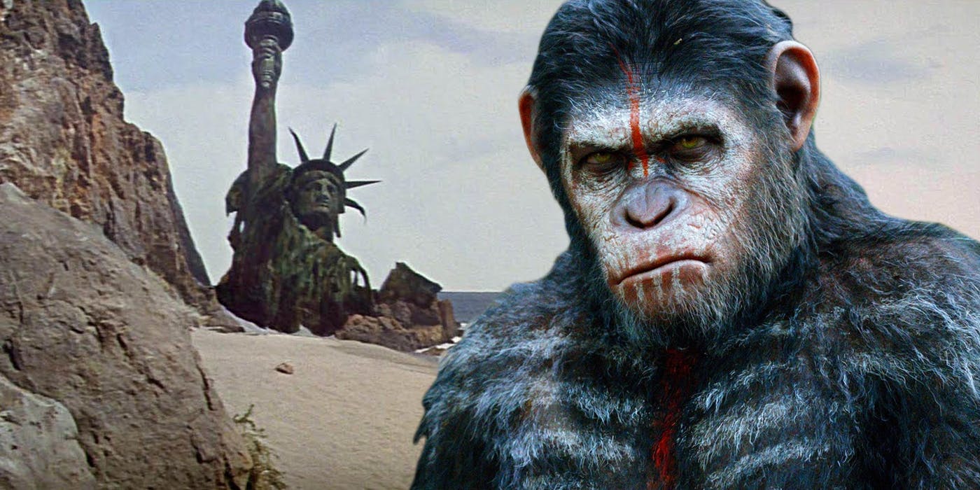
Design a character through the story of their details from a fictionalized future. This is both a world-building and a character-design project. You will design one or more human(oid) character(s) and their Sci-Fi utopian or dystopian environment.
EXAMPLES:
HOW:
Your focus here should be your ideas of how the character’s world informs their design. In your final design, craft need only be as polished as required to communicate your ideas.
Create a version of the future beginning by imagining a timeline of events that bring us from NOW to this imagined future.
The timeline is meant to help you answer key questions about the world. This world will be the inspirational source for your character’s appearance and should be explained through the details of their clothing, armor, skin, tattoos, markings, etc., and their surroundings.
The concept art should contain sufficient pieces to explain both world and your characters to an audience unfamiliar with your story. Include items such as model sheets, character designs, and at least one image of the character in the environment.
For a great example of character design based on a future world check out this early trailer for Nausicaa and the Valley of the Wind:
Official Trailer from Nausicaä and the Valley of the Wind by Hayao Miyazaki
Note in the description below how the timeline has influenced the world, and how the world in turn has shaped the main character.
“A thousand years after a great war, a seaside kingdom known as the Valley of the Wind is one of the only areas that remains populated. Led by the courageous Princess Nausicaä, the people of the Valley are engaged in a constant struggle with powerful insects called Ohmu, who guard a poisonous jungle that is spreading across the Earth. Nausicaä and her brave companions, together with the people of the Valley, strive to restore the bond between humanity and the earth.”
Work must be done in traditional 2D media or digital and printed
Sketches and process must be shown*
Work should be 11×17
The final work will be in color, traditional or digital is fine
*Concept development is 50% part of the grade
• SKETCH A LOT • DO NOT GO STRAIGHT TO YOUR FINAL •
SCHEDULE
November 17 Introduce project in class. Discuss parameters. Brainstorm and research
December 1 Bring sketches and notes for group discussion and workshop. Be certain to have a timeline and a SHORT blurb such as the one for Nausicaä above which links your character(s) to the world they inhabit. There will be time for working in class.
December 8 Bring the finished design in sketch form. Have all of the details articulated and drawn out, not just described.
December 15 Present final concept and character designs in class. Each student will be given 5 minutes to present their project.
This is the way I usually work, but not all the time…
Scan – scan your work at twice the output resolution (300 dpi = 600 dpi)
Scan your work neutral and save all color correction for Photoshop
Open scan in Photoshop
Color correct to optimize your lineart
Add contrast to push the white areas to 255/255/255 in RGB
Use hue/saturation to desaturate to -100% to pull all tone out of scan leaving it a virtual grayscale.
Add a solid color layer (blue hue) on “screen” using previous layer as clipping mask to change lineart to blue lines if you will be inking it digitally.
Lineart with Flats for Color
Copy background layer and change blending mode to multiply
Add a new layer between background and copy and fill with white
Use lasso and bucket to fill entire layer with solid color, checking your work to ensure there are no gaps between fills
Once you have colored in the entire image duplicate the color layer, set that layer to multiply (blending mode) add a layer mask and fill with black
Use the lasso, brushes etc. to brush back the duped color (multiply) layer back in for level one shading
Duplicate color layer a second time, desaturate completely (hue/sat layer -100% saturation) to turn this color into a secondary shading layer.
Repeat shading or try using lower opacity brushes, possibly selecting certain areas with the wand tool and using a gradient fill, etc.
Duplicate color layer and change to “screen” blending mode. Possibly adjust the color to brighter shades, if necessary. Repeat masking and exposing for highlight.
Experiment adding highlights with a solid color or curve layer to add contrast and bounce light, i.e. secondary light sources.
Add contrast to push the white areas to 255/255/255 in RGB
Use hue/saturation to desaturate to -100% to pull all tone out of scan leaving it a virtual grayscale.
Add a solid color layer (blue hue) on “screen” using previous layer as clipping mask to change lineart to blue lines if you will be inking it digitally.
Lineart with Flats for Color
Copy background layer and change blending mode to multiply
Add a new layer between background and copy and fill with white
Use lasso and bucket to fill entire layer with solid color, checking your work to ensure there are no gaps between fills
Once you have colored in the entire image duplicate the color layer, set that layer to multiply (blending mode) add a layer mask and fill with black
Use the lasso, brushes etc. to brush back the duped color (multiply) layer back in for level one shading
Dupe color layer a second time, desaturate completely (hue/sat layer -100% saturation) to turn this color into a secondary shading layer.
Repeat shading or try using lower opacity brushes, possibly selecting certain areas with the wand tool and using a gradient fill, etc.
Duplicate color layer and change to “screen” blending mode. Possibly adjust the color to brighter shades, if necessary. Repeat masking and exposing for highlight.
Experiment adding highlights with a solid color or curve layer to add contrast and bounce light, i.e. secondary light sources.
Michel Gagné was born in Québec, Canada. He studied animation at Sheridan College School of Visual Arts in Ontario, Canada and in 1985, began a highly successful artistic career.
Renowned for his unique vision, Michel has lent his talent to several animation companies, such as Don Bluth Studios, Warner Bros., Disney, Pixar, Cartoon Network, Nickelodeon, etc. His creative work can be seen in over twenty feature films including “The Iron Giant“, “Osmosis Jones” and “Ratatouille“.
Michel is also active in the publishing world having written and illustrated several books and comics, such as “The Saga of Rex” and “Insanely Twisted Rabbits”. His work has been published by DC Comics, Image Comics, Random House, Fantagraphics, as well as Michel’s own imprint, GAGNE International Press.
Nicolas “Nico” Marlet is a character designer, visual development and animation artist best known for his work on animated features like How to Train Your Dragon, How to Train Your Dragon 2, Kung Fu Panda, Monsters, Inc., Bee Movie, The Road to El Dorado and others.
Marlet’s character design drawings just about jump off the page with their springy energy. His model sheets show a wild and abundantly creative imagination.
Marlets’ work is part of the Art of How to Train Your Dragon 2 exhibit currently at Gallery Nucleus in Alhambra, CA (to July 6). There is a preview of his Sketchbook on their site as well.
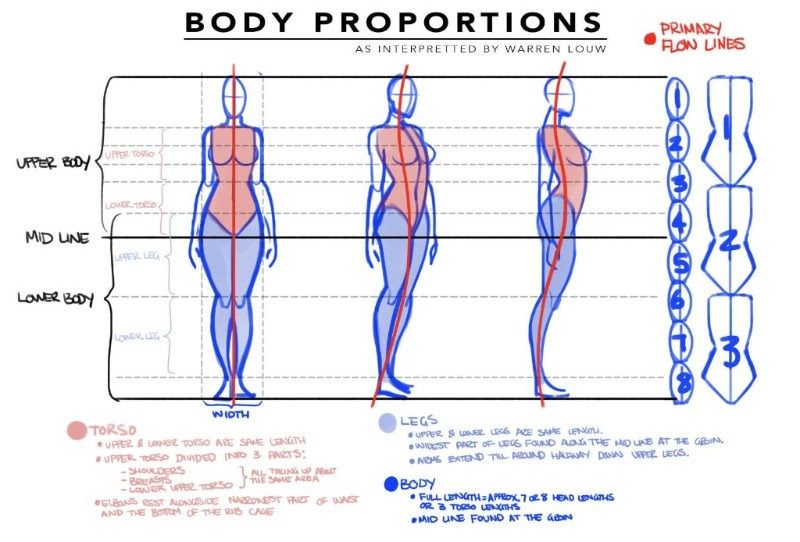
What is a turnaround or model/pose sheet? Turnarounds show the figure/character from three or more angles, giving all the necessary details and proportions to give direction to anyone else who will need to draw it. These are used for animation, video games, comic books, fashion, and more. They help give artists a sense of what the character will look like from every possible angle and while in motion. These help everyone working with that character to stay “on model”.
Note how the artist uses her BASIC shapes to accurately turn ELIZA around in space.
Here’s a guide for (somewhat heroic) proportions by Warren Louw:
NOTE how the proportions of the body stay consistent and the height remains level as the character is seen from different angles.
DUE NEXT WEEK:
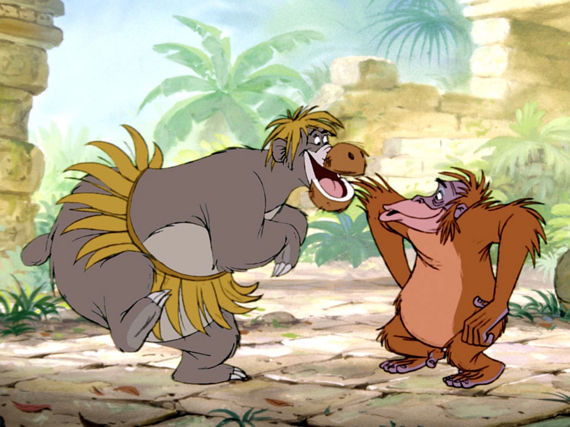
Homework 2: FRENZIED FAUNA
SKETCHBOOK PROMPT #2
*EXTRA CREDIT ALERT!*
INKTOBER!
Here are the official Inktober prompts from Mr. Jake Parker himself. There are always a ton more of these floating around, so feel free to search and find one that better suits you, or don’t use prompts at all! Stock up on pens from ArtSnacks and JetPens or your friendly neighborhood (cooperatively owned and run) art shop, Artist & Craftsman.
Inktober rules:
1) Make a drawing in ink (you can do a pencil under-drawing if you want).
2) Post it*
3) Hashtag it with #inktober and #inktober2022
4) Repeat
Note: you can do it daily, or go the half-marathon route and post every other day, or just do the 5K and post once a week. What ever you decide, just be consistent with it. Inktober is about growing and improving and forming positive habits, so the more you’re consistent the better.
That’s it! Now go make something beautiful.
*Post it on any social media account you want or just post it on your refrigerator. The point is to share your art with someone. 🙂
This is the online home of the course. This is where you will find all your syllabus, supply list, weekly class outlines, assignments, lecture materials, and additional helpful resources.
“I can’t emphasize enough how important it is to have a good idea of who your character needs to be before you put pencil to paper; who they are when we first see them, and who you want them to be when at last we leave them. This approach leaves a lot of room for creative choices along the way, but also saves time by shaving away most of the bits you won’t be needing when you first sit down to sculpt out these folks.”
“Personality usually dictates design, so I consider Silhouette, Shape , Proportion, and Pose.”
Pick a subject, could be anything. Like a dog, or a truck, or a helicopter, or a self portrait, or a tree house.
Grab a sheet of paper and divide it into 6 even sections.
Click play on this video and when the timer starts you have 4 minutes to draw your subject in one of the sections. When it beeps again you start another drawing in the second section, but this time you only have 2 minutes to draw it. Then do it in 1 minute. Then 30 seconds. Then 15 seconds. And finally 5 seconds.
Now compare your drawings.
It’s a great exercise for getting faster and better at drawing. A side benefit is that it lays a foundation for you to find your individual style. Cartooning: Philosophy & Practice by Ivan Brunetti: http://amzn.to/1KFbfD3
Please join MIRO and POST your 8 minute drawing challenge during the break!
Lecture: Simplicity of Form and Design By Shape
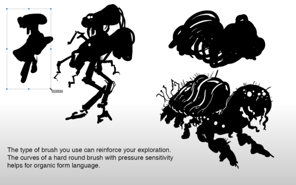
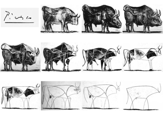
Always simplify and exaggerate: What makes a thing a thing? How few lines are needed for Picasso’s bull to remain clearly a bull?
KEY CONCEPTS:
Simplify
Exaggerate
Play with Proportion
Use Shape Language
Clarify
Make Multiple Iterations
Due Next Week
For HOMEWORK and SKETCHBOOK assignments, go to HOMEWORK in LEFT NAVIGATION MENU
IMPORTANT NOTE:
In the Resources Section of this site you’ll find an ever-expanding library of inspiration and help including:


